Interior Designers live and breathe interiors - amazing rooms, that perfect piece of furniture, just the right paint colour. We love it! Unfortunately we don’t have a secret rule book we follow. But there are key principals we use to ensure we create spaces that are perfect for you and your lifestyle, that you absolutely love!
Here are my top, tried and true tips for a designer interior.
1. style never goes out of fashion
Don’t get too caught up with the latest design trends in the permanent fixtures and fittings of your home. Remember that trends come and go - but you’re investing for the long term.
My general rule - trends are for accessorising, not for the overall design.
2. creating balance
Create a balance of levels in your space, especially with higher ceilings.
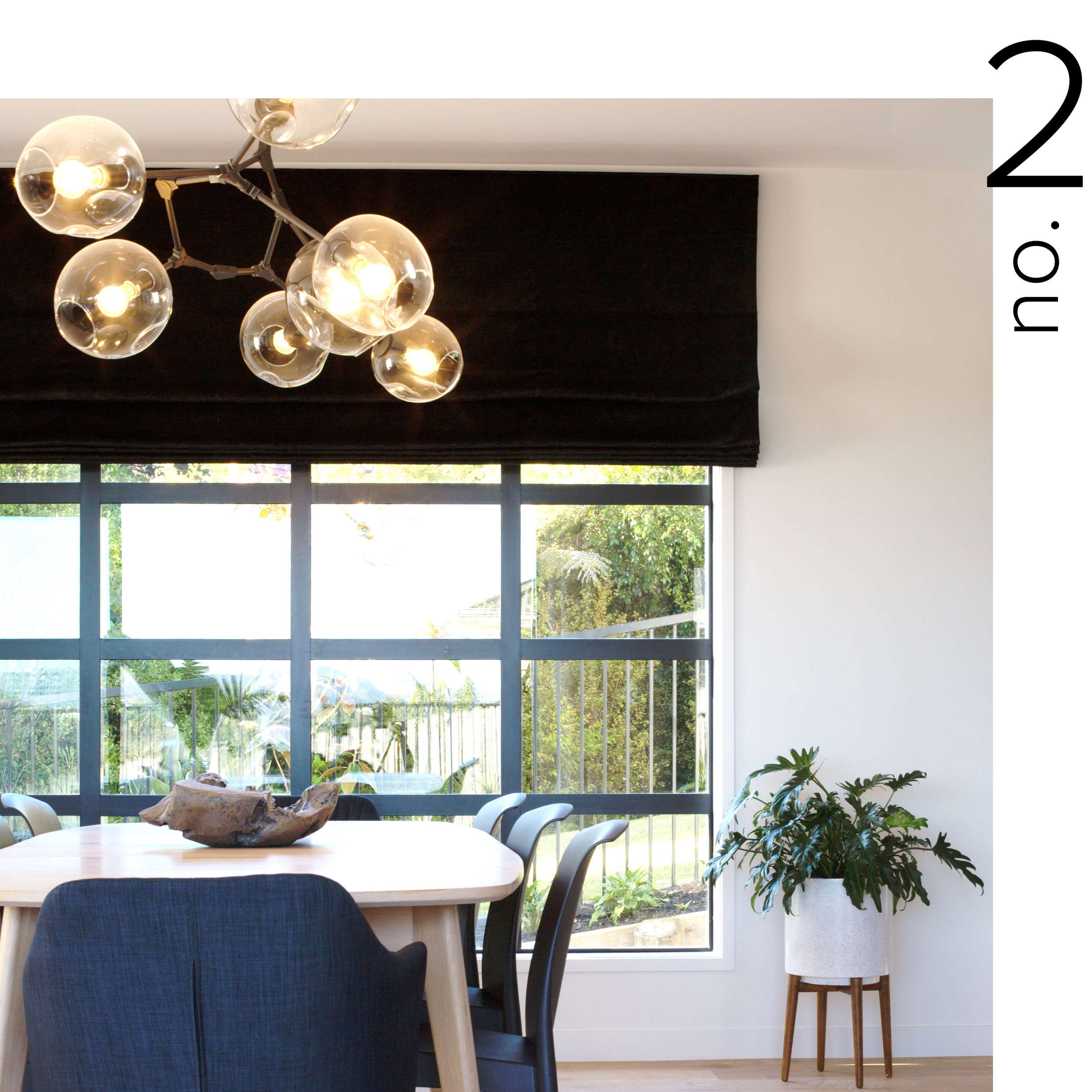
Use pendant lighting, artwork or tall plants to ensure a room doesn't feel bottom heavy.
3. be bold and make a statement
Personality is what makes a space unique and special. I truly believe that incorporating personal style and pieces with a story are what turn an average room into a stunning one. Be brave enough to be yourself, not just following the latest trends, and then you’ll create a home you’ll still love for years and years to come.
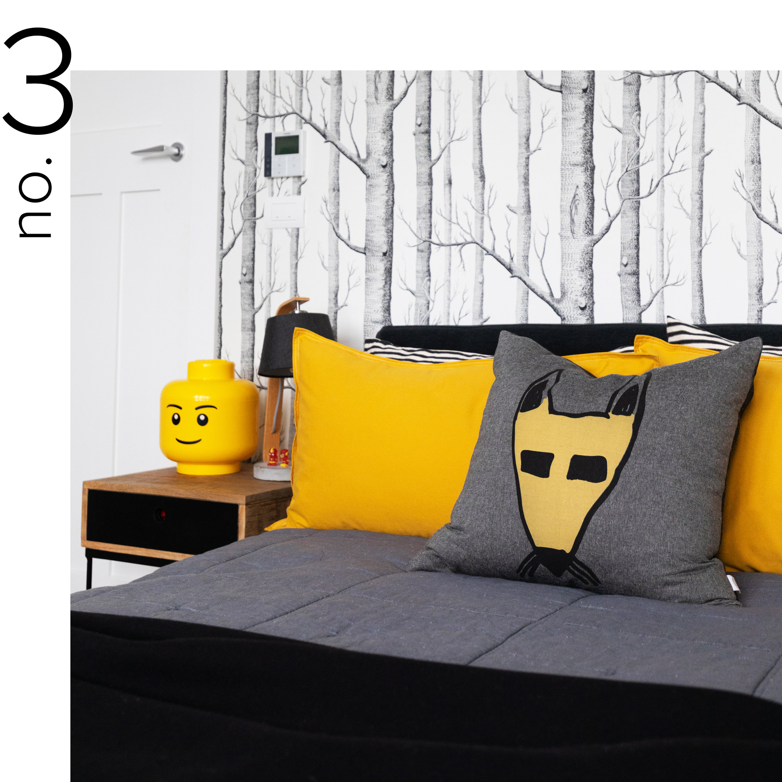
In this young boy’s room we used elements that would grow with him over time but also made sure it’s a space he loves right now by adding hits of his favourite colour - bright yellow.
4. no-one ever regretted buying quality
Nothing beats quality. Invest in pieces that will last a lifetime. Every item you purchase doesn’t need to be high end, but consider spending more on special pieces that you absolutely love and that add real style and personality to your home - the sofa you’ll sit on every day, an occasional chair in a fabric that you adore, a piece of art that makes you smile every time you see it or a feature piece that will become a collectible.
In the words of master designer Vivienne Westwood, “Buy less, choose well.”
5. style your shelfie
Shelf styling is a way of adding a personalised & stylish finishing touch to a home. Here are our simple tips to up your own shelfie game:
1. Start with the larger pieces first - this helps get the scale and balance right
2. Books instantly add a more personal, lived-in feel to your shelf
3. Greenery adds a hit of life and colour
Finally, always take a step back, objectively view your styling and edit until your eye is happy.
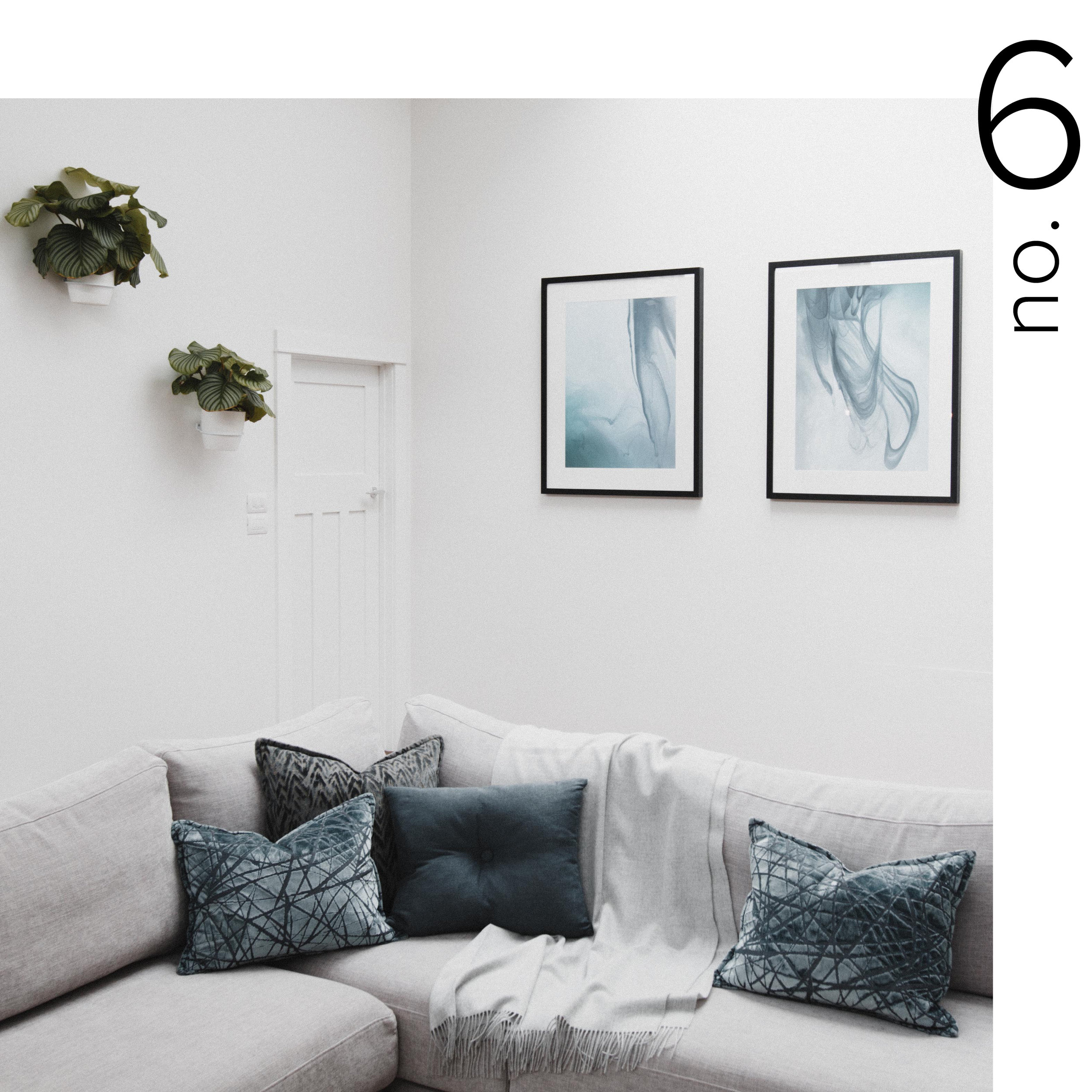
6. cushions for extra luxe
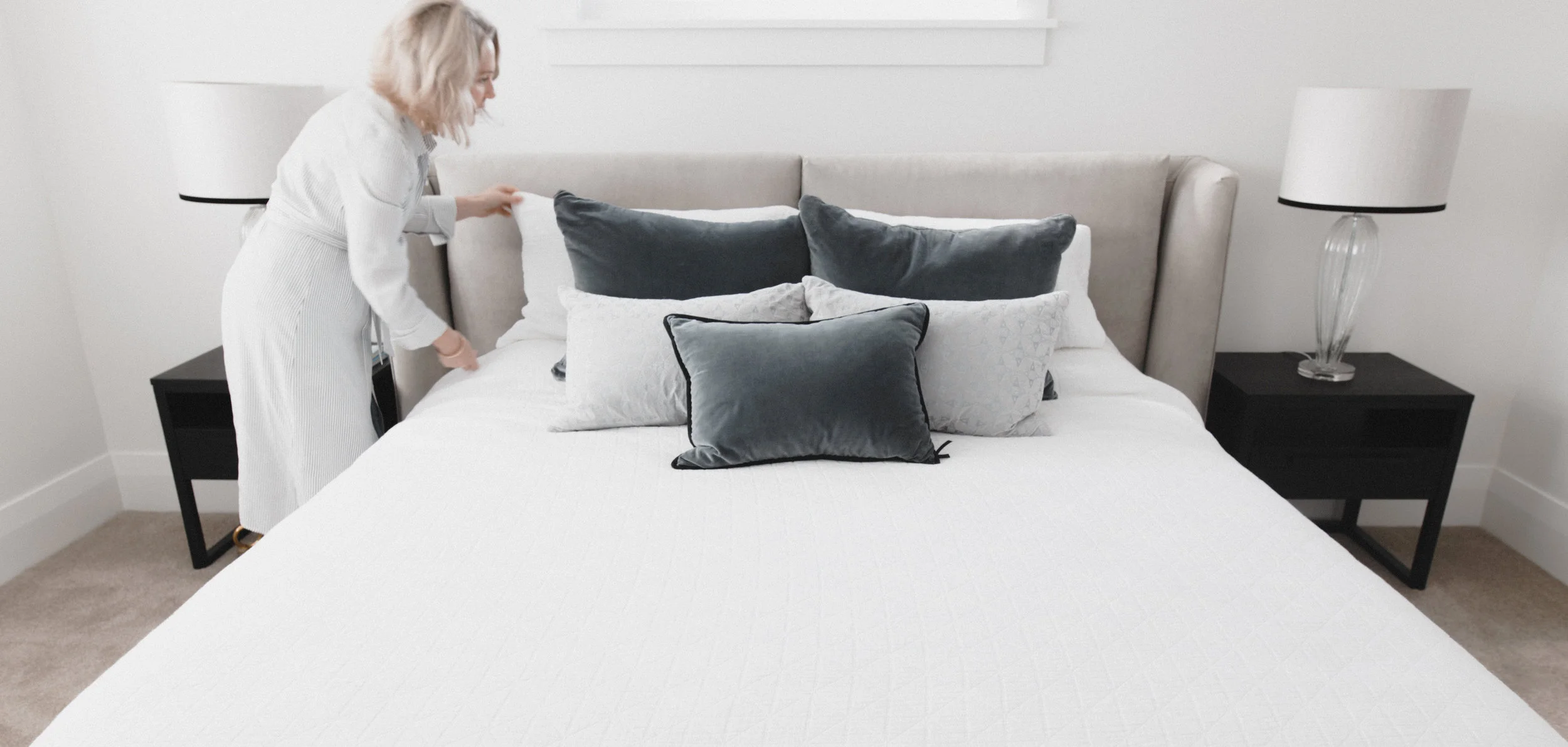
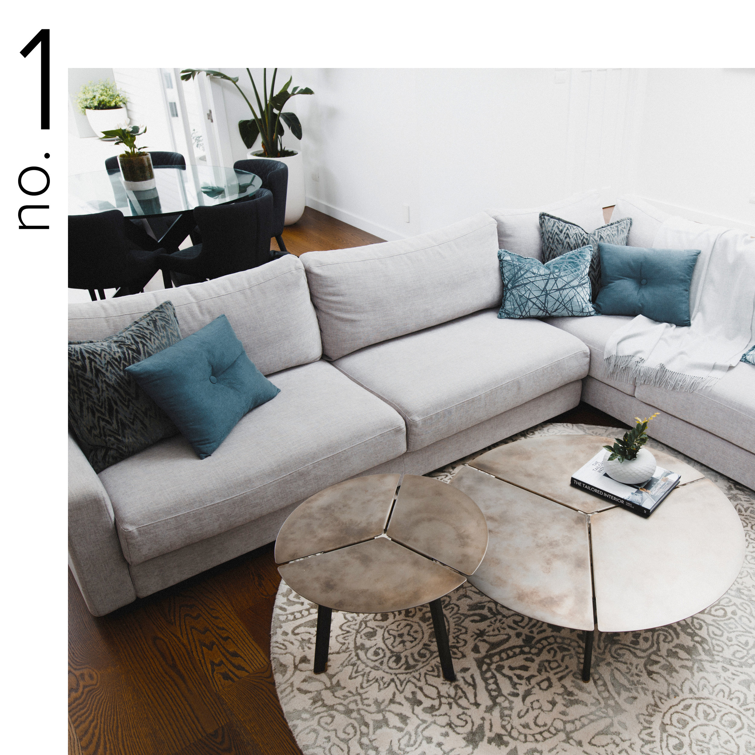
The best way to make a sofa look more luxe is by adding some fab cushions. Cushions are a great way to add colour and texture to a room - look for special fabrics. One pair of cushions always looks skimpy. Use two pairs per sofa in contrasting patterns, colours and textures. Switch up the sizes and shapes so they’re all not exactly the same, like a larger square cushion with a smaller rectangular one. And think big - your cushions should be at least 45 x 45 cm.
Inside edge: Always go for a feather inner - they don’t cost that much more but look and feel so much more luxurious.
7. drapery must be floored
Whatever the style, curtains should always touch the floor.
Like these gorgeous linen drapes, I like curtains to skim the floor or puddle slightly.
8. making plans
Like any project, time invested up front saves time and money down the track. Plan your “look” with a mood board to help you visualise the end result. Use Pinterest or simply cut images you love from magazines. Look for the themes in the images you’re drawn to - colours, style, lines, texture, mood.
Having a clear vision will prevent impulse buying and ensure the finished space works as a whole.
9. think of lighting as jewellery
Pendant lighting can be a fab design feature and the perfect finishing touch for a space. Think of your pendant lights as a key accessory - plan them into the overall look of the room early on and link them with other elements and materials.
Remember to have dimmers installed so that they can provide both functional and ambient lighting.
10. edit!
A key part of styling is editing. When you’re done, stand back and try to critique the space objectively and then edit - move and remove until it works.
Tip: Coco Chanel said about accessorising: “Before you leave the house, look in the mirror and take one thing off.”
11. rugs
The size of a rug is key - too small and it will look like an island, too large and it can make the room feel swamped. The perfect rug anchors a room and defines the space.
12. lush leaves
Bring the botanical vibe inside your home with loads of lush, green foliage. Displayed en masse they can bring drama and beauty to a room. And if you’re like me and aren’t blessed with the greenest of fingers, a vase of monstera leaves always looks amazing.
13. mix materials
But don't overdo it! An amazing space has a varied palette of materials, but one that is restrained.
Limit yourself to three or four - choose one stone, one metal, one timber, and various fabrics. Then repeat them throughout your home for visual continuity and harmony.
14. use mirrors for instant style points
Mirrors are an amazing interior accessory:
They create a sense of light and space
Can be an economical piece of wall art
And they will reflect a beautiful view or feature.
15. tray that display
Instead of displaying books, objects or vases of arrangements directly on your coffee table or console, style them in a tray for a more finished, deliberate look.
It's a great way to group smaller items together to make a statement.
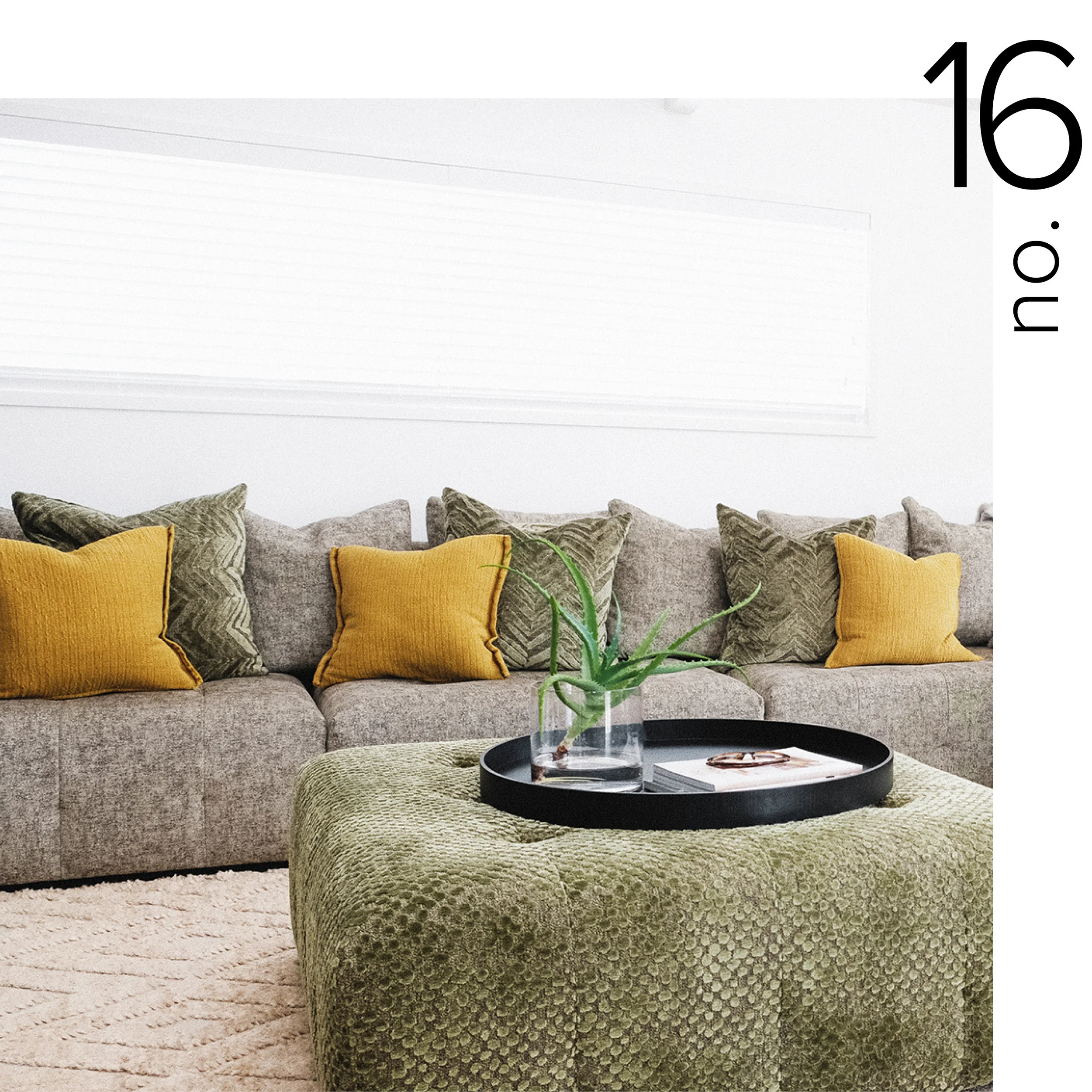
16. don’t skimp on the sofa
If there’s one item of furniture to invest in (besides your bed), put your money into a comfortable, well-made sofa that you’ll have for 10 years or more. Don’t postpone a sofa makeover because of your kids! So many fabrics are now stain-repellant and will more than pass the kid test.
Tip: A custom sofa doesn’t need to cost that much more than something you’d buy from a retailer - and you’ll get a sofa in exactly the fabric, style and size you want.
17. pick the paint colour last
Yes, paint can transform the look and feel of a room, but it really is the backdrop that should complement everything else in the room.
There are thousands of paint colours - you can even create your own bespoke hue. So start with other finishes that are a bit more complex - flooring first, then window furnishings, fabrics, rugs and artwork.
And then choose the paint colour that best complements the room.
18. your furniture should be functional and beautiful
Furniture should be enjoyed!︎ There are 1,000s of beautiful fabrics to choose from in an incredible range of colours, patterns, textures and compositions.
So you should never have to settle for an average option - choose something that’s fit for purpose and that you absolutely love - like this gorgeous polka dot fabric - a neutral that will work with different accent colours but is still super fun!
19. pick your hero
Think about what is going to draw attention in the room. What is going to anchor the space? It may be an amazing pendant, a piece of art, a fabulous fabric or a statement splash back.
Choose your hero and allow other items to have supporting roles. This ensures the room has balance and a clear focal point - not clutter and visual noise.
20. style your surfaces
When a styling a table, shelves or sideboard, I like oversized pieces for dramatic effect, rather than surfaces cluttered with lots of smaller items. If you truly love something, put it on display - use and enjoy treasures from your travels, special books and family pieces.
Make it interesting, think about proportion and playing with scale - and change it regularly.
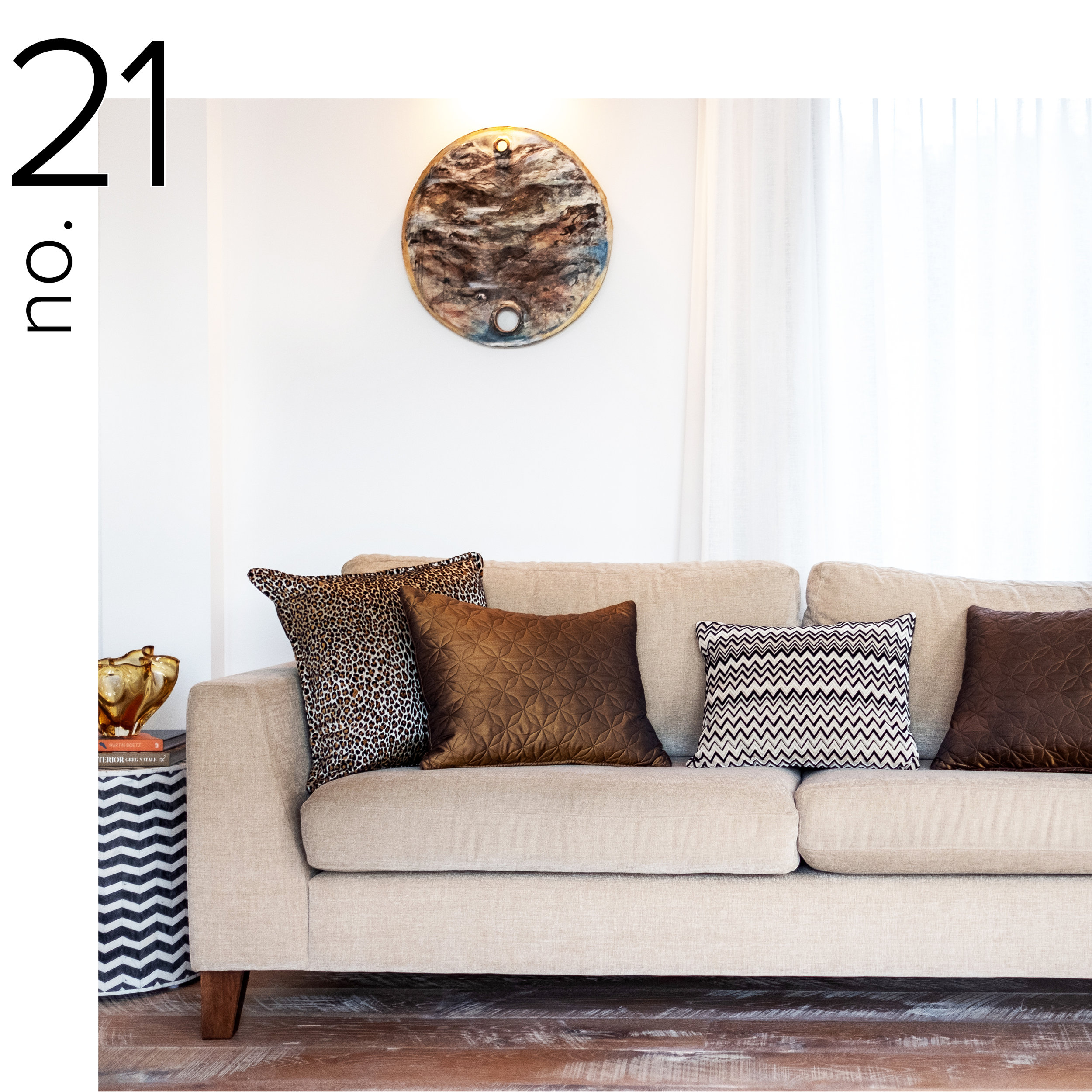
21. we love clients who embrace a bit of theunexpected
Your home should reflect you and your style - and that will never be boring! Have fun with your selections - choose patterns, colours and pieces that have personality and a stylish edge.
“The best design projects are ones where people break the rules.” - Nate Berkus
22. neutrals aren’t boring
Neutrals are stylish, restful and timeless.
But always layer + layer + layer for depth and interest. Layered textures and a simple colour palette will always win.
23. granny knows best!
Don't hide away those special family pieces of furniture. Adding items with an emotional connection to your room is what makes it special, unique and yours.
Use pieces creatively - an old chest as a bedside table, reupholster a family favourite chair in an amazing fabric, pair an heirloom desk with a fun, modern chair.
24. less is definitely more
In any space, editing is one of the most important steps. Paring things back to the main pieces, eliminating the superfluous is key for a sophisticated and sleek look.
So clear away all those non-essential items and unnecessary accessories. Make the focus on your room and the beautiful pieces in it.
25. invite nature indoors
The best way to balance out sleek lines and contemporary furniture is by adding natural elements to your decor from driftwood to coral to plenty of greenery.
26. accent with black
Sometimes it can be as simple as black and white.
Black accents will always add edge and style to a room. But get the balance right and use it judiciously to anchor a room and create contrast.

