design edit issue 17 | design tour
STATEMENT DOWNSIZE
This home is almost totally unrecognisable from the cobweb-clad beachside bach it was when our client first purchased it. Kirsten Ford Design helped to completely renovate the home, inside and out to create a stylishly functional space that's perfect for entertaining.
THE BRIEF
Our client engaged us to reimagine the space and create a home as a true reflection of its owner: modern, stylish, well travelled.
The client was downsizing in scale, but didn’t want to compromise on style. The design needed to be functional and practical - with plenty of “wow” factor. The brief: a modern yet timeless space that was a welcoming retreat - and one with stylish edge.
“I was a bit nervous about using an interior designer but Kirsten was a delight to work with - she listened carefully, she understood my objectives & achieved something I could never have done on my own. ”
COLLABORATORS
The 65m2 home was structurally sound but had received virtually no maintenance over its 34 year life. The home was relocated on the site, turned 90 degrees to the North, decking and a garage were added and the interior spaces reconfigured to better utilise the space. These structural changes were designed by the clever guys at LTD Architectural Design Studio.
INSPIRATION
The brief included retaining the white exterior of the original bach, but as a modern contrast we added new black joinery and roofing. We continued the play of contrasts inside with crisp white paint against dark features.
The sandy toned oak flooring, with striking black knots, echoes the beach beyond.
DESIGN DETAILS
The original interior of the batch was completely gutted. Kirsten Ford Design completely reimagined the space, creating an open plan kitchen, dining and living area which connect to the lushly landscaped outdoors.
The crisp white walls seamlessly continued to the pitched ceilings, which originally had dark timber beams, heightening the sense of space. The feature of the living area is the dramatically dark, custom built cabinetry. Much consideration was given to the kitchen cabinetry which cleverly wraps around a corner, providing a wealth of storage, a dark background for the television and, best of all, a hidden bar!
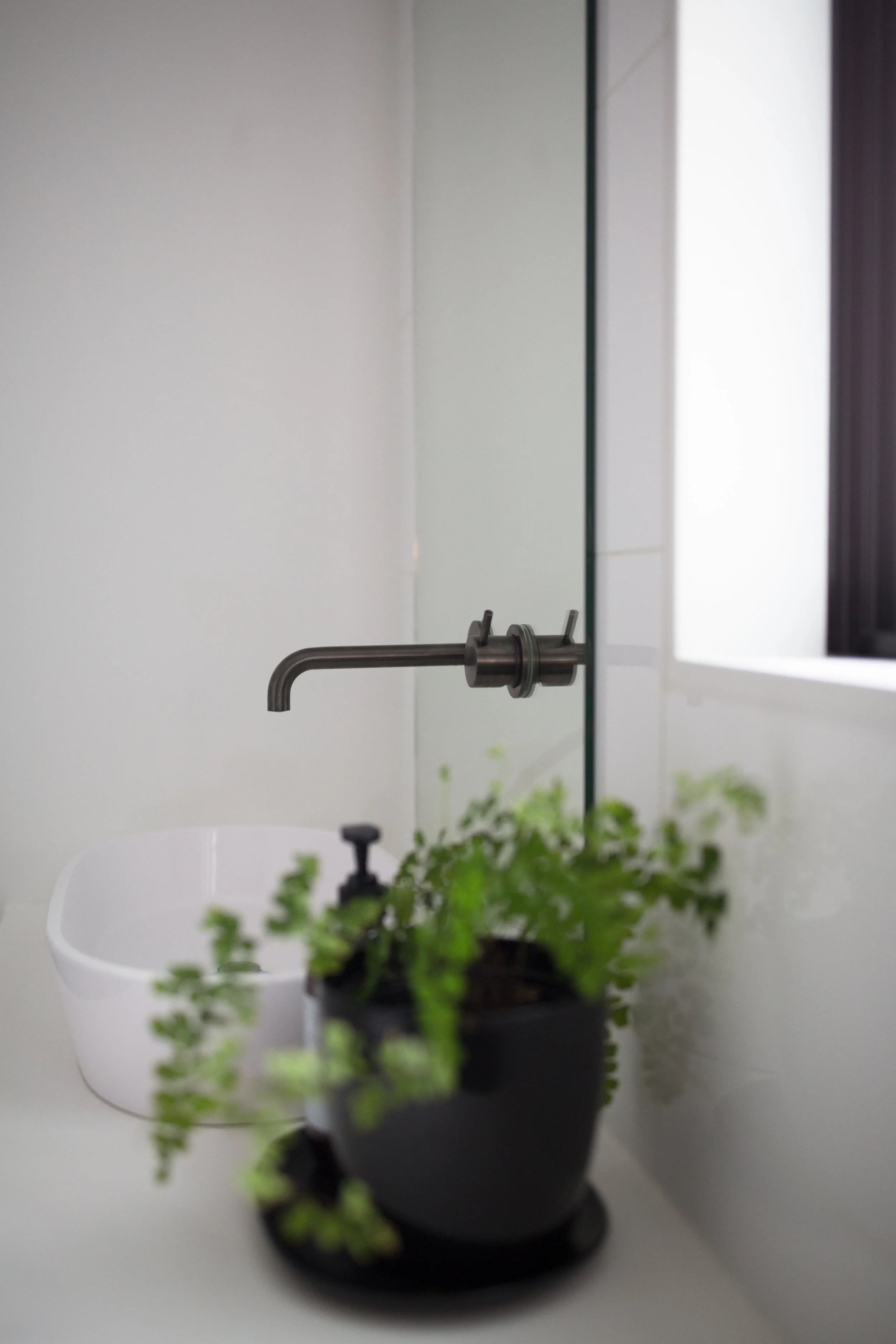
Clean, simple lines, like hidden black handles and push to open drawers, and the rhythm of repeated materials again add to the feeling of space. Black accents like aged iron tap ware, a black sink, black tiling on the kitchen bench front and black curtain rods all up the style quota.
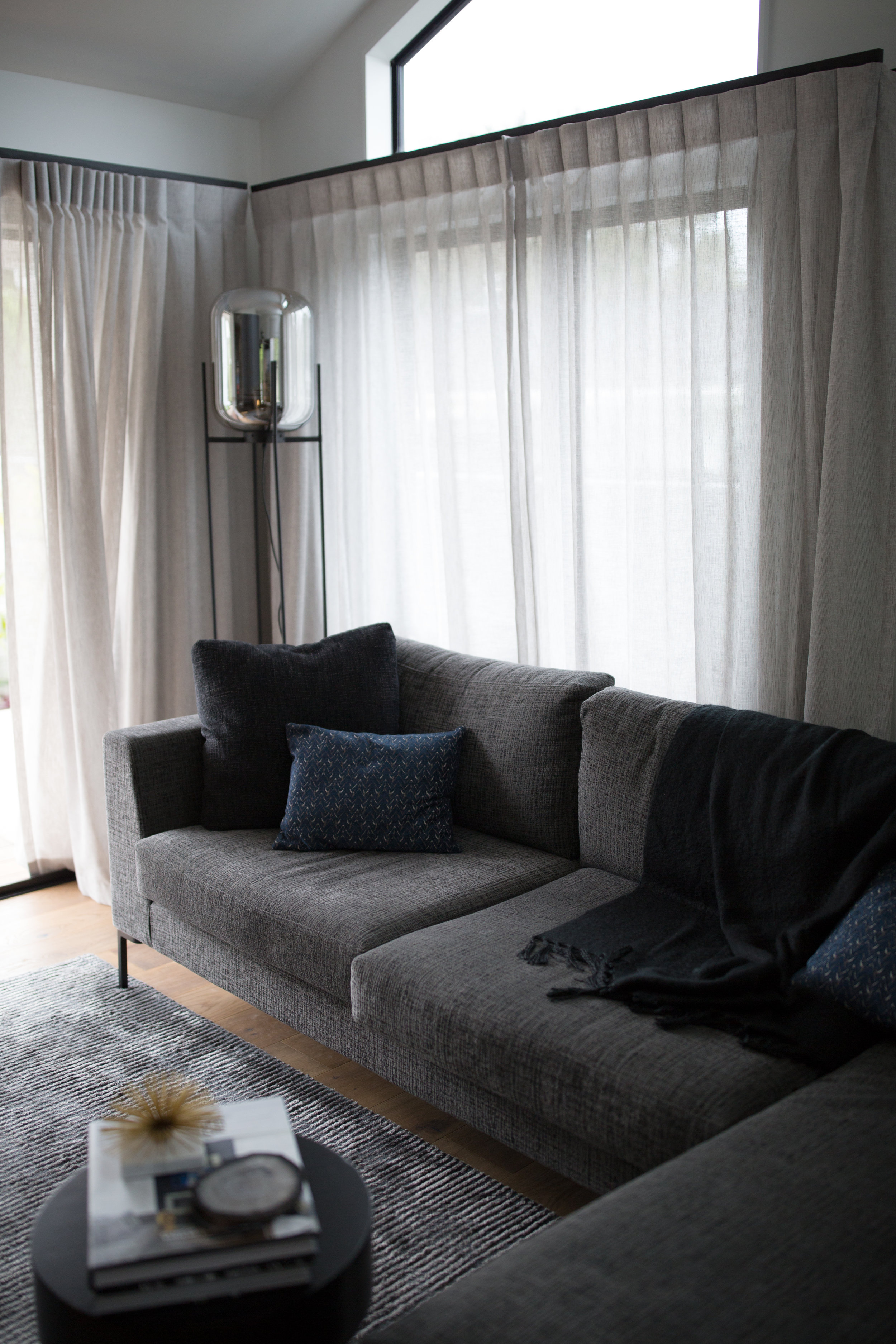
We integrated some of the client's existing furnishings and carefully selected key new pieces, layering blacks and inky blues for a masculine but still welcoming look.
The black cabinetry material continues into the master bedroom where a custom bedhead with wall-hung custom bedsides create a stylish, hotel style retreat - the built-in furniture also maximising the space.
“I love the master bedroom - the perfect blend between hotel and a home, with clever design features that maximise the space and style factor.”
INSIDE EDGE
A host of design tricks helped create a sense of space in this smaller home:
continuing the same timber floor through all the living areas
crisp white paint to reflect light around the space. And continuing this wall colour to the ceilings - without any fussy trim detailing
repetition of colours and accents, and simple clean lines
light drapes hung well above the window architrave draws the eye up to the pitched ceilings
furnishing with hero pieces of furniture, rather than cluttering the space with many smaller pieces
built-in cabinetry to provide a simple storage solution, with a recessed toe-kick to give a "lighter" feel
custom furniture, like the sofa, are perfectly scaled to maximise the seating but still allow a sense of space
THE RESULT
The result is a stylish, surprisingly open space that’s perfect for entertaining with a master bedroom that’s the perfect blend of hotel and home. A home that's compact in size, but big on functional style.
“The result is stunning - a modern, comfortable & beautifully finished home. Friends & family are very impressed.”
See the entire project gallery here, including Before photos.
Contact Auckland Interior Designer Kirsten Ford for more information.
Images: Emily Chalk Photographer


